
Data Visualization
- Timeframe: 02/13 – 02/27
- Points: 250
Description
In this graphic design project, you will learn how to make sound design decisions, how to represent data visually, and how to draw with Scalable Vector Graphics (SVGs). We will learn about basic types of charts, the fundamentals of marks and attributes for charts, and then how to draw SVGs in Inkscape.
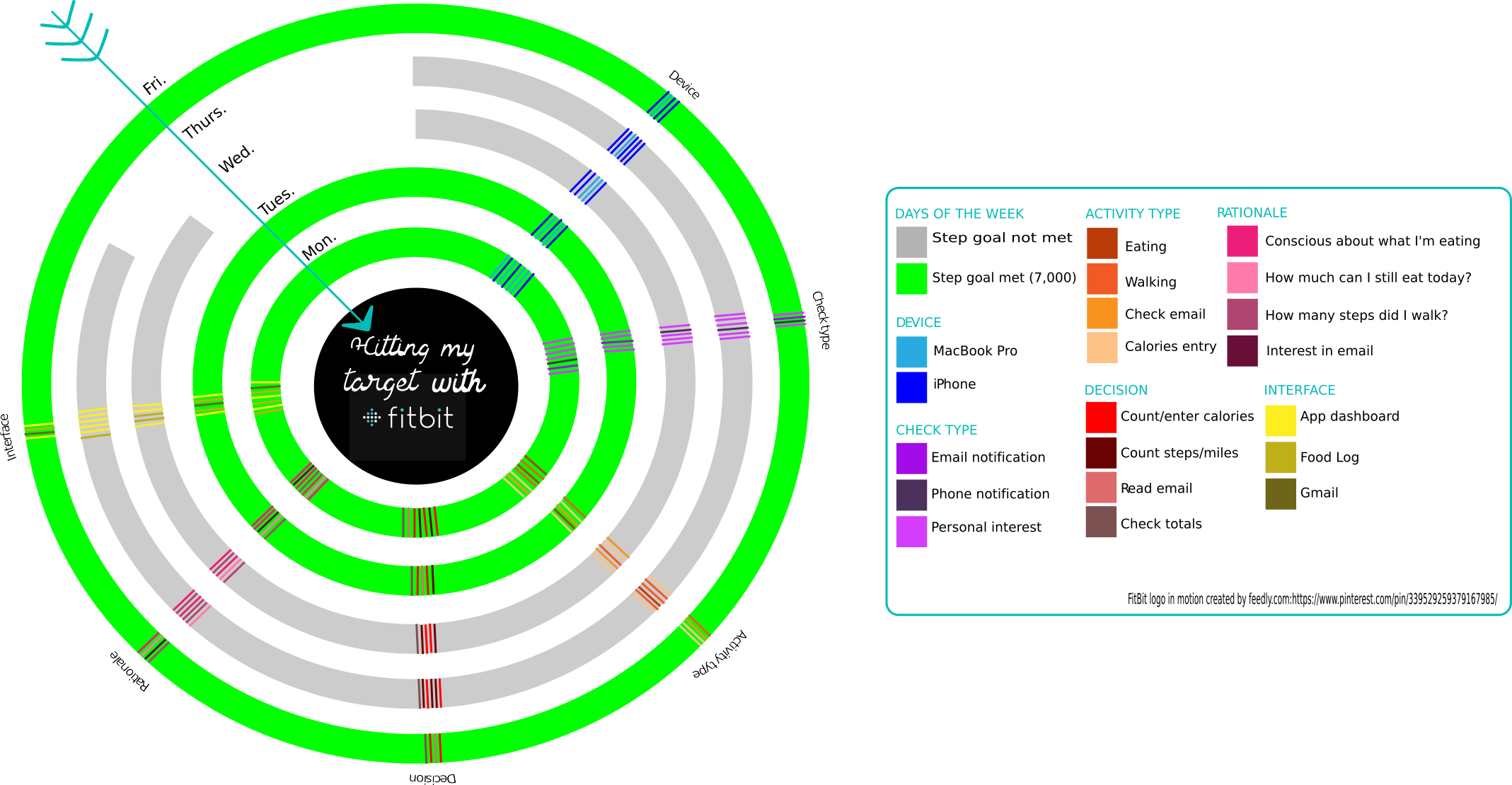
Below are 2 examples created by students in prior courses:

General process
- Learn about the basic data visualization conventions: types of charts, marks, and attributes.
- Explore and analyze your data by first plotting it out temporally by drawing it by hand.
- Decide what datapoints are most interesting and worth amplifying with another chart type, or a revision to the temporal chart.
- Learn basic Inkscape skills.
- Sketch your data visualization on paper.
- Draw your data visualization in Inkscape.
- Clean your SVG for the web, making it semantically rich.
- Export the SVG to submit as an Inkscape .svg and a .png bitmap image.
Rubric
| Rubric Criteria | Points |
|---|---|
Chart Type:
| 100 |
Marks and Attributes:
| 100 |
| Ethically represents your findings. For example, if proportion is important, carefully create sizes and do not use circular marks, etc. | 20 |
Legend:
| 20 |
| Semantically-rich SVG markup: Uses labels and IDs to name meaningful groups of the chart: data types, parts of the chart, etc. | 10 |
| Total | 250 |